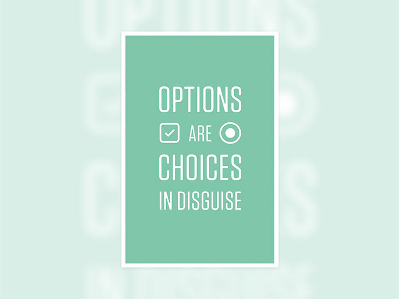
They're also decisions and choices in disguise
A while ago, I saw this Dribbble shot from Morgan Allan Knutson and I have to say, other than thinking the design of the poster was visually pleasing, the message on the poster didn't really mean that much to me.
But…
Recently, I've been working on the rewrite of KashFlow's software alongside a dedicated UI/UX guy and noticing how much thought goes into the tiny details which can swing the mood of a user to polar opposites of the spectrum; a big no no.
What I've noticed, more in life than in UIs, having gone through these UX processes, is that people genuinely hate or get flustered being presented with options...or decisions in disguise.
I was sat in a restaurant the other evening (ok, it was a chip shop, but hey, who's keeping count?) and was half listening to a man order his meal:
Him: "fish and chips, please",
Her: "large chips or small chips?",
Him: "ummm, large",
Her: "large fish or small fish?",
Him: "oh, er, ummm, small please."
The initial request from the man would have sufficed. I'm guessing (and I haven't looked into Chip Shop menu conversion rates) but if they just had:
Fish - £X
Chips - £X
then I really don't think people would stop coming to the establishment to eat. Four steps removed and friction eliminated in an ordering process. Easy.
People hate being presented with choices, it requires them to think. People don't generally like being forced to think (generous helping of generalising aside), they really don't.
An instance that springs to mind is at the barber shop a couple of years ago, at the end of the cut I was asked whether I want it "off the neck?". I had no clue what that really meant and was generally cautious with my response and which route I committed to. One wrong decision and I could have ended up with a bowl cut. In other words, they should have decided.
When you go to the garage to get your car fixed, you're not asked if you want the carburettor fitted way [x] or way [y]. I like when I pay for a service or product and they've made these choices for me. If I don't like the choices they've made, then I'm also happy for them not to allow me to change it. If I change [x], then I've changed the way they've intended for me to use their product or service. I'll go use a different product, but that's ok.
Apply this to your product and you might not get as many users but the users who truly like the product for what it is, stick around.
When was the last time Apple let you change the core values of their products? Never. You use Apple products because they have a magnanimous amount of confidence in the decisions they've made for you and your usage of their products.
Getting Real
"Customers shouldn't have to think about every nitty gritty detail - don't put that burden on them when it should be your responsibility."
This quote from 37 Signals' "Getting Real" book really stuck out for me (in fact, most of that chapter did really).
It's kind of like going, "Well, erm, I dunno, this is a tricky UI/UX decision, oh hell, we'll let the user decide." Passing the buck to the user to make the UX decision for you? Sounds worse when it's put like that, huh?
Development
Not to steal the words right out of Jason Fried's mouth but options, preferences, setting, configurations genuinely do add a fair bit of development time and you're going to have to find a nice way of displaying this UI to your users so they can change these preferences. Settings pages aren't sexy. Maintaining these options in your code also isn't sexy.
Have confidence in your UX and UI decisions and put a concrete set of values in your product. Don't pass the buck to your users!
